Automatic translation of the archived Russian text. Recordings and text within images remain in their original language. Read the Russian original
About this material
The story of making Fill the Bar alone in two days, from preparation and the initial idea to content production and the Ludum Dare submission. Its central device is an unexpected transition from a simple 2D screen to a three-dimensional world.
Over two days off, December 6–7, I made a game from scratch for Ludum Dare. Now I want to tell you how it went. But first, I suggest taking a look at the game itself. Be sure to turn on the sound.
What Is Ludum Dare? Ludum Dare is an international competition in which you make a game on a given theme within a limited time. There are two categories: Jam and Compo. For the Jam, you can enter as a team and use prepared or publicly available assets. You get 72 hours. The other format, Compo, requires you to work alone and create everything from scratch. You may reuse code, but must publish your source code at the end. The Compo time limit is 48 hours. Read the detailed rules here. A few facts: * The competition has run since 2002 and is probably the most popular rapid-development game jam. The latest event produced 2538 games. * Markus “Notch” Persson, creator of Minecraft, wrote in his farewell letter: “I will leave Mojang and go back to doing Ludum Dares.” * Lucas Pope, creator of Papers, Please, also takes part regularly. * On Steam you can find 16 games that started at Ludum Dare. * Members of the Russian indie scene take part regularly, such as the Molecats, Alexey “DiscoFish” Starovoyt, Alexander “Dyn” Pavlov. When I learned in mid-November that the next Ludum Dare would be on the weekend of December 6–7, I couldn't resist entering. It was a chance to join the international indie community and get noticed by the masters.
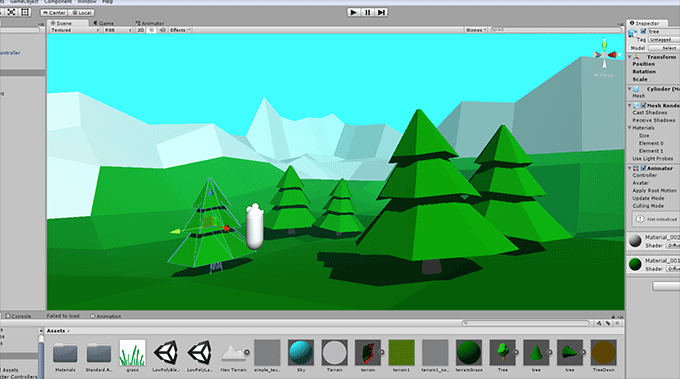
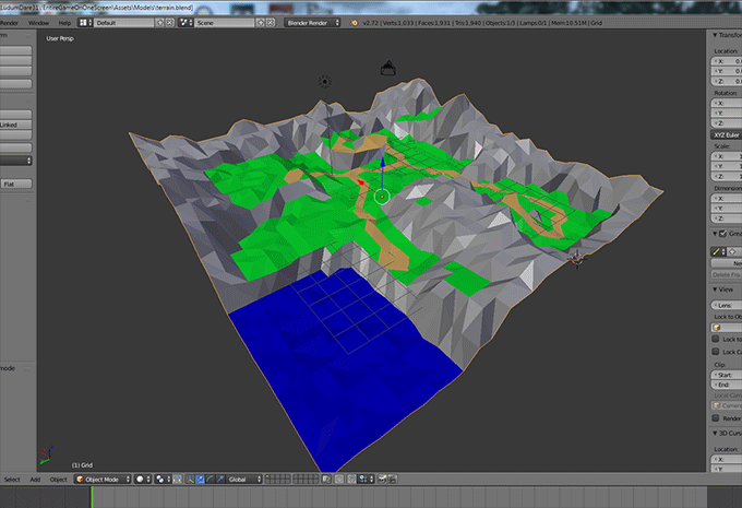
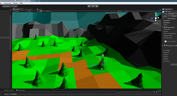
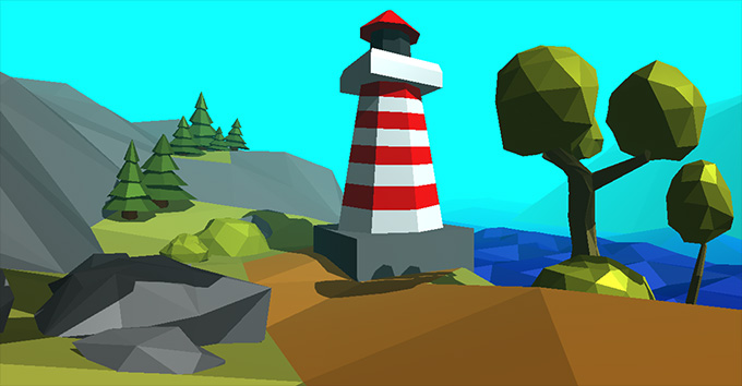
Advance Preparation I've always believed good preparation is half the battle. So I decided to answer in advance the questions that would arise regardless of the theme. Engine The first question, of course, was the engine. That didn't take much thought. For a competition like this, a web version matters above all, to maximize the proportion of visitors who actually play. My choice was Unity, since I already knew it reasonably well from working on “Message Quest”. Flash was another option: it is capable enough to make a competitive game. Unlike GameMaker, which not only lacks a decent web version, but forces developers to rely on the bare idea alone. You can count the decent-looking games made in it on one hand. Although I did once use it to make an Android game. Unreal Engine 4 made a separate bid for attention by handing out 90-day trial codes one day before the competition began. Unity had announced its Pro trial giveaway in advance. I think that, with experience making games in UE4 and the ability to model quickly with bump and specular maps, you could have stood out on visuals. But every UE4 entry I found had a downloadable build of up to 800 MB, awful graphics and no gameplay. I think Epic should have prepared participants before giving away keys. Art and Sound Next I saw two major risks. The game needed decent graphics, and I couldn't even produce indecent graphics. I draw terribly. Perhaps I could have shown off using photographs, but that's a bad idea for a web game: photos are large files, so loading could take longer than some people's patience. The game also needed music. Although browser users usually prefer silence, most competition games have music, so its absence would stand out as a flaw. For the art, I saw only one way out: a simplified style. Something like pixel art, but not pixel art, which I was already sick of. Had I used Flash, I might have found something in vector graphics, but choosing Unity pushed me to study low poly art, which I'd been eyeing for a while. Low-poly graphics are also lightweight: just right for a web version. The first steps turned out to be less difficult than I feared. At first I tried making art from Unity's primitives: a coarse terrain mesh, placing and stretching cubes and spheres. It was so-so. The terrain still concealed the irregularities and blended the materials smoothly. Then, after consulting Stanislav Gailyunas, a Molecats developer, I decided to learn Blender. It's fast, free, and has low-poly video tutorials. Simply following every step in the tutorial was enough to get comfortable with the new tool and learn to make something. After an hour of learning, I replaced the terrain and primitive trees with my own low-poly work. It looked much closer to what I wanted.
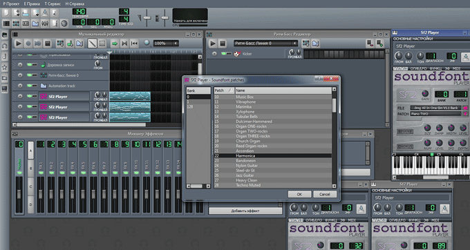
Next came making music. I had neither experience nor training, so I asked the community. Evgeny Vinakov replied, recommending Musical Palette for making MIDI music according to music theory, and LMMS for applying instruments. Both programs are freely available. Musical Palette has a built-in tutorial and hints. Within minutes of launching it, I was making something resembling music. LMMS was even easier: I only needed to replace instruments and save to a standard audio format. Unity doesn't support MIDI, and rightly so: the squeaking and buzzing of the standard “instruments” is exhausting. Though the format is very compact for web versions. To let LMMS replace instruments, you need to supply a SoundFont instrument library. The internet is big, so finding something standard is easy. The editor freezing during export is a problem, though. Luckily I worked around it by exporting from the command line: lmms.exe <project name> -o <export filename> -f <format, e.g. wav>. I then loaded the result into Audacity, also free, and saved it again with the format and quality settings I needed.
I'd resolved the technical questions that worried me. All that remained was to study past winners and understand the expected standard. I formulated it as a set of requirements: The interpretation of the theme should be original yet easy to grasp. The game should be cohesive. Visuals, gameplay, sound: nothing should lag behind. It should be a complete experience. The player should reach the ending in 5–15 minutes. The core gameplay should be fun in its own right, without metagameplay. The Art of Game Design explains this well through the difference between games and toys. Later, looking at other entries, I saw people undermined by missing some of these points. A beautiful game that's boring to play. An interesting interpretation, but an unfinished game. Fun to play, but with poor graphics and missing the theme.
Day One The competition begins with the theme announcement on Friday evening, which in my time zone was 6 a.m. Saturday. There was no reason to get up that early. So what if others started sooner? They would go to bed sooner too. Taking part in a creative competition without enough sleep is foolish. So I slept until 9 a.m., checked the theme, Entire Game on One Screen, and kept lying there, thinking it over while half asleep.
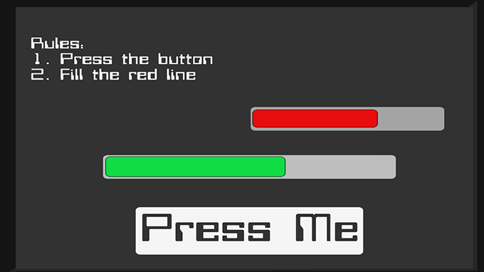
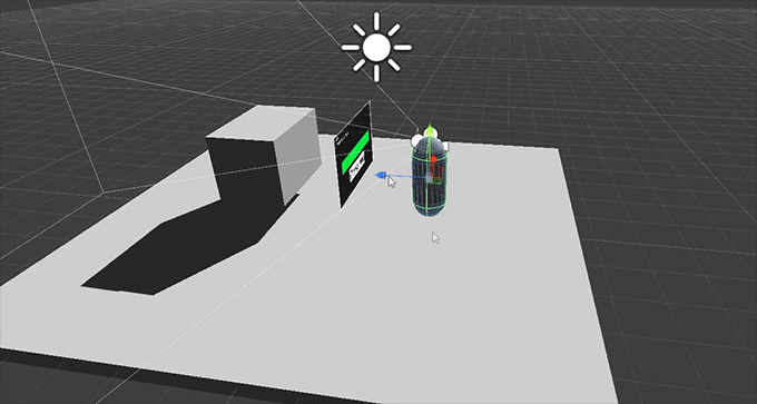
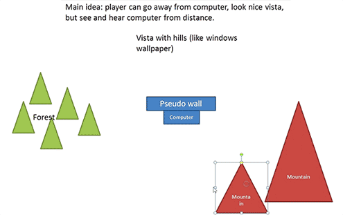
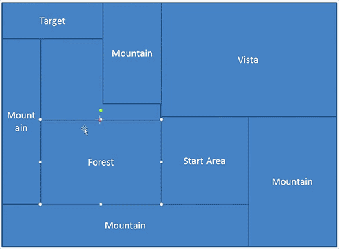
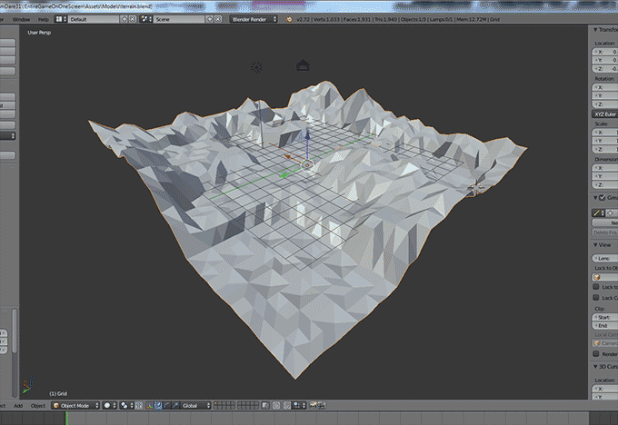
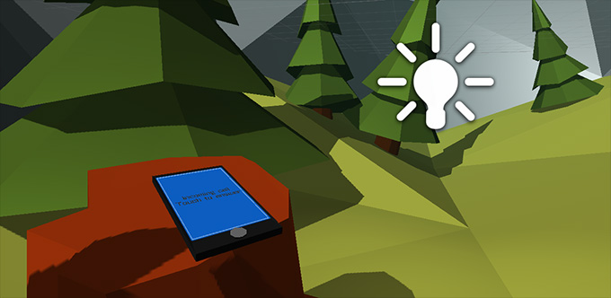
Naturally, the first thing I did was reject the idea that the entire game would take place on one screen. Too obvious. Besides, it's a theme to interpret, not a rule to obey. I started checking game ideas that had long been developing in my head against the theme. The first match was using the new UI in Unity 4.6, which lets an interface screen float in 3D space rather than stick to the camera. Another idea prompted by that engine update was lots of buttons and progress bars. We all know how satisfying it is to watch a bar fill up. The urge to complete unfinished things is hardwired into our brains. The second idea was that low-poly art was mandatory. I hadn't learned it for nothing. The third was to use speech synthesis. I'd previously thought about how indie developers tend to skip voice acting because it's costly and burdensome. But if all the characters are robots, a speech synthesizer is perfectly appropriate. It all came together as a simple Portal-like story. There is a flat world of bars, where the player performs meaningless actions because a computer asks them to. Then there is a beautiful 3D world the character can escape into. But their happiness lasts only until they find a mobile phone. The moral, roughly, is that you can escape a computer screen's power just by stepping aside, but there is no escaping the phone screen's power. Once the picture came together, I started working. The first day's goal was a complete gameplay blockout, with all necessary functionality and placeholders for key assets. By the end of the day, the build should be releasable, albeit embarrassingly so. Day two would be for improving it: replacing placeholders, detailing the world and writing music. First, I created a Unity scene with a flat platform, an FPS controller and a floating canvas containing a button and green progress bar, a slider with its handle disabled. Pressing the button fills the bar, which then empties again. You can press the button at any time to stop it draining and refill it. Then I made a second, red bar that fills as the first empties. The first holds 100 arbitrary units and the second 200. You therefore have to completely fill and drain the green bar twice to fill the red one. Next came an upgrade screen: three buttons on a backing panel, so all three could be moved together. I decided the first two upgrades would speed up progression, while the third would be decorative. Does the player want to reach the meaningless result faster, or furnish their “workplace”? The first two options cycle repeatedly, while the last changes, suggesting a unique progression. So sooner or later the player should take the final version of the third upgrade. Crucially, they should get there by themselves, without hints. When the player takes the last special upgrade, the game starts checking for a press of S, the step-back key in WASD controls. If pressed, FPS controls are enabled, a dot appears at the center of the screen, and the FOV changes slightly. Now I needed a location the player could walk around. Classical planning was unavoidable here. I knew the starting point: the spot where the computer stood. The task was to decide what surrounded it. I should note that I chose a generic setting to make it instantly recognizable. The diagram's job is to establish which elements exist and how they relate spatially. Then comes a more specific, to-scale diagram. With a diagram showing the mountains' positions, I start making a heightmap. I color in the main areas: walkable ground, roads, nonwalkable ground, and water, also nonwalkable. I add a few fir trees to provide a sense of scale. The brain knows a fir tree's average size and can use it to judge distances. Playtesting can begin now. The first test aims to assess the scale and overall shapes through the player's eyes. I feared the location would be too small and need expanding, but playtesting put that fear to rest. The size was just right: enough room to wander, but not too big to finish dressing. At this point I set the map aside and work on the phone, a sort of goal for the player to find while exploring. Like the computer, the phone is a simple model with a canvas where the screen should be. The phone model produced a strange bug. Whenever the camera faced the phone, the sky changed color, even though the model and sky shared no materials. Only deleting the model and making a new one fixed it. If anyone knows what could cause this bug, please let me know. There was another phone problem, caused by my own inexperience with the new UI. When adding text fields, I changed their height and width to shrink them. As a result, even a font size of one was too large. I later learned I should have reduced them using scale. Another task was to make the phone face the player, guaranteeing the text could be read. I added an invisible object to the player's camera and used its coordinates as the phone's target when activated. Vector3.Lerp handled the smooth movement. The phone thus flew to the center of the screen regardless of where the player stood or looked. Getting it right took a while. To avoid replaying the entire opening bar-filling sequence every time, I made a cheat button that enabled walking immediately and placed the phone near the start. The day was over. Thanks to tackling the right things at the right time, I had a build where you could fill a bar, step away from the computer, walk through a simple location, find a phone, and thus finish the game.
Day Two
It was time to give the computer a voice. After trying several speech synthesizers, I settled on this one . I chose the Lee voice because it wasn't too friendly. The synthesized result was too high-quality, so I added the Duration Long effect to give it an artificial edge. Adding the computer's first lines changed the game dramatically. First, it now had voice acting, rare in games this small. Second, it had a character. Third, it had feedback on the player's actions. Filling bars was no longer merely mechanical, but a way of interacting with a character. At the beginning, the computer explains the rules: a tutorial familiar from other games. All these rules are also displayed beside it, like workplace instructions. Then the computer learned to comment on upgrade choices. If the player picks speed upgrades, it praises them. If they pick special upgrades, it disapproves, more sharply each time. But it doesn't react to the final choice, as if it hasn't noticed the change. The player, however, sees the real rules and sees what has to be done to change the situation: break a rule. Once the player steps away, the computer needs a line asking them to return, and lines to say if they do come back. The player hears that the computer enjoys every button press: an explanation, so to speak, of its motivation in all this. After the voice work, I modeled the environment, refining the landscape and adding objects. The existing fir tree was joined by 2 kinds of trees, 2 kinds of bushes and 3 kinds of rocks. I placed firs in one part of the map in groups of 2–4. One tree in each group was noticeably larger and the others smaller. Some I stretched vertically and then shrank so they looked young. I rotated all the trees slightly in different directions to avoid visible patterns.
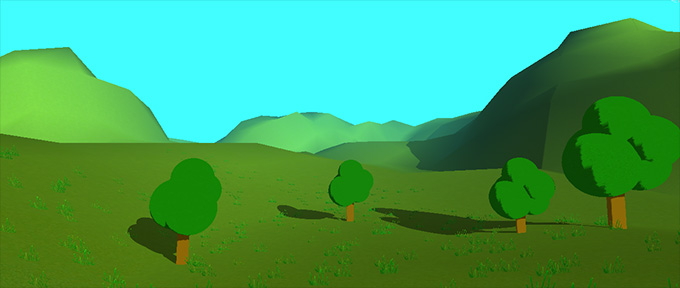
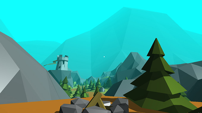
The map was filling with detail but lacked substance. So I added large unique objects, first a lighthouse, then a tower. Initially I wanted the tower to be climbable, but couldn't get collision working. A single-mesh object worked fine, but composite objects produced collision oddities: wrong sizes and rotations. There was no time to investigate, so I left the tower unclimbable. Attempts to add signs of damage produced a strange result, which I developed into something like eyes and a mouth. If players see a face in the tower, they can invent a story about it. I put the phone the player can find on a specially modeled stump. But I didn't want a road leading to it. Who builds roads to stumps? So it sat casually beside a path leading to a clearing. Lacking imagination, I put an ordinary campfire there. I then used that view as the game's cover, to show that it contains beautiful scenery and hint that only players who walk past the phone will see it. Unfortunately, I never figured out what to do with the lighthouse, tower and campfire. The objects are there and you can approach them, but then what? The best idea was to play a woman's voice telling a story about each place. But no decent stories came to mind, especially in English. If the ideas won't come, it's time to move on. I also realize now that a twist from dull 2D to colorful 3D is all very well, but the game starts with dull 2D, which can put many people off. Only easy gameplay and voice work can hook them. I can't say anything useful about writing the music. I just moved dots around in Musical Palette, then tried replacement instruments in LMMS. In Unity I arranged for the computer's music not only to fade as you walked away, but for a second musical theme to start. The phone also acquired a ringtone to attract attention. A ringing phone prompts action far more effectively than a brick lying on the ground. Then came final camera-position adjustments, a little fiddling with upgrade numbers, building the game and a last test. All good. I upload the build and source code to my server, prepare the entry, and publish. The game is made and submitted. Now it's time to browse other games, rate them and wait 20 days for voting to end.